
")
")
Hello Constructors!
There are times when any game can give you a headache, especially when some of its elements are unintuitive and hard to locate. Navigating through the system should proceed smoothly, without any obstacles, so you can enjoy your game in peace to the fullest. From what we’ve heard from you, some UI elements weren’t so intuitive as we believed them to be. We listen to your feedback and suggestions – that’s why we took this matter into our own hands! Let us present you some of the examples of UI improvements we’ve been working on recently.
CODEX, QUEST LOG
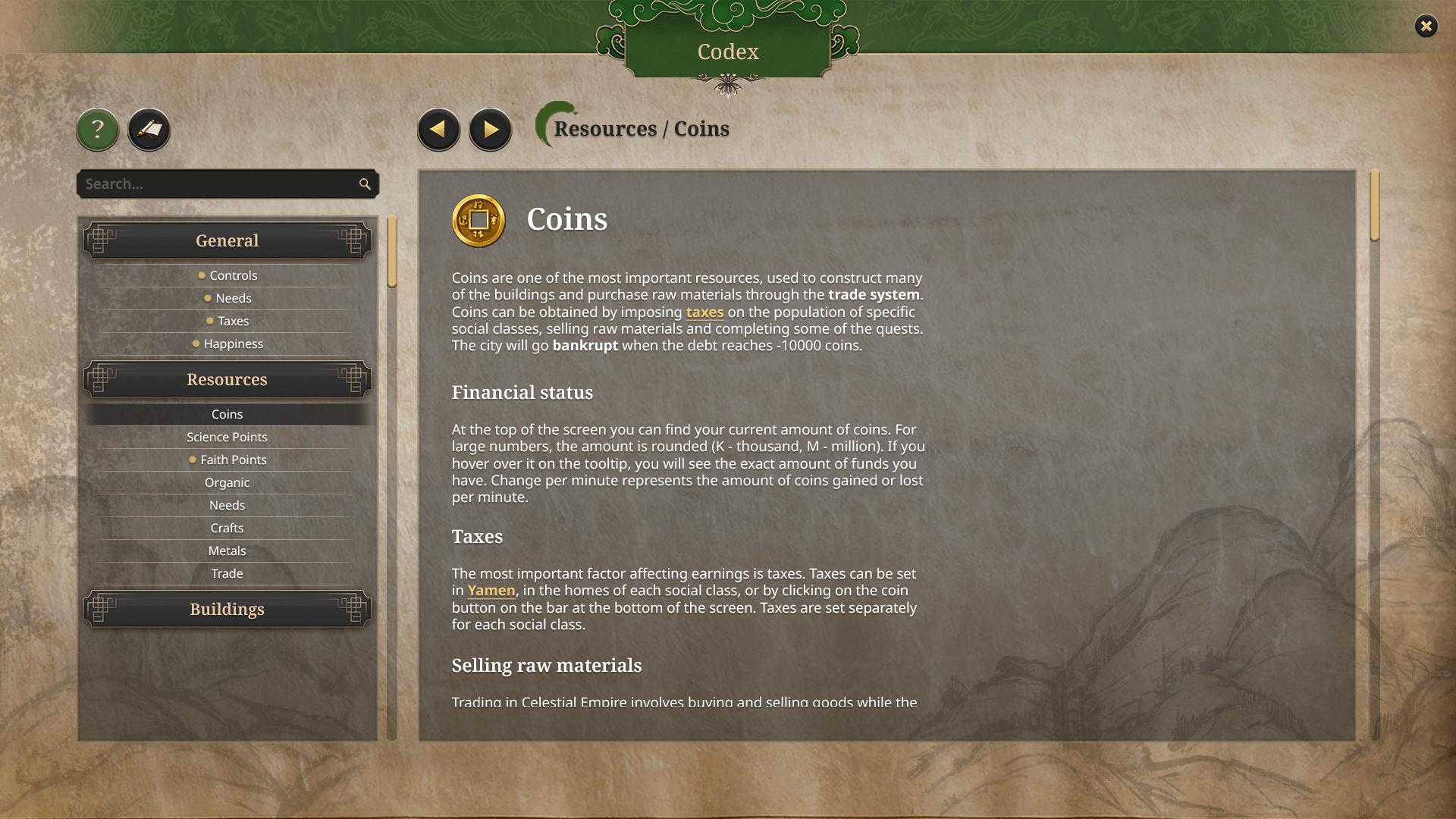
As you can see, codex is a whole new section you haven’t been able to see before in the demo release. You are the one who suggested we make one! It’ll pose as your guide through Celestial Empire – explaining the controls, mechanics, resources, buildings and so on. So, anytime you feel lost, or you just want to make sure how anything works, checking the codex is definitely a way to go! To get to the codex, first you have to open quest log by clicking on a question mark visible on an upper bar of a quest (look at: screenshot under "lower bar" section). There you are able to switch tabs and switch to the codex straight from the quest log.
As you can see, codex is a whole new section you haven’t been able to see before in the demo release. You are the one who suggested we make one! It’ll pose as your guide through Celestial Empire – explaining the controls, mechanics, resources, buildings and so on. So, anytime you feel lost, or you just want to make sure how anything works, checking the codex is definitely a way to go! To get to the codex, first you have to open quest log by clicking on a question mark visible on an upper bar of a quest (look at: screenshot under "lower bar" section). There you are able to switch tabs and switch to the codex straight from the quest log.
STATISTICS
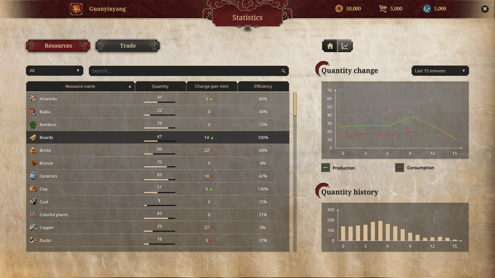
You’ve been mentioning that it is hard to keep track of your income, resources or traded goods. That’s why we implemented yet another tab, that will let you check it all in one place instead of going through multiple tabs. You can check a resource's quantity change or its quantity history.
You’ve been mentioning that it is hard to keep track of your income, resources or traded goods. That’s why we implemented yet another tab, that will let you check it all in one place instead of going through multiple tabs. You can check a resource's quantity change or its quantity history.
LOWER BAR
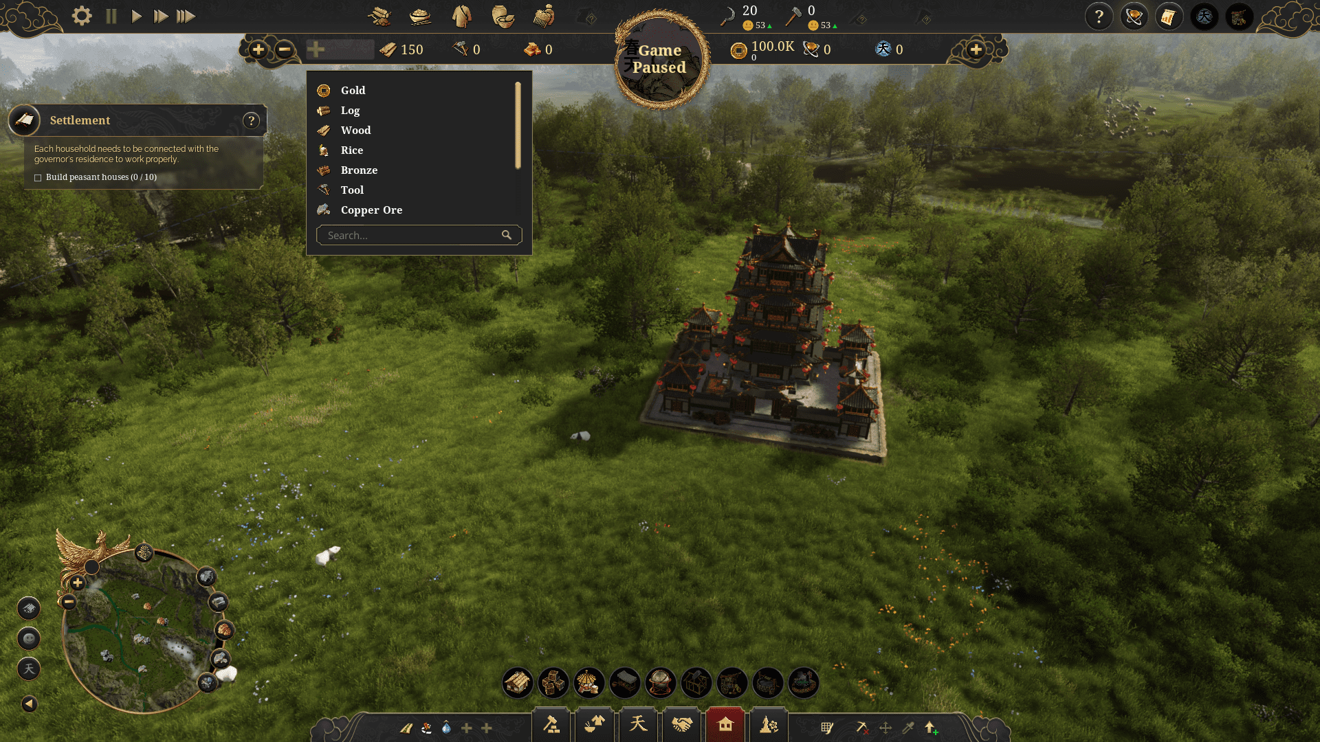
Even the lower bar had its redesign, as it is the UI element you will probably be using the most. There were a few problems to address: its unintuitiveness, chaotic sorting of categories and tools. Now every icon represents one of some building categories, so everything was sorted anew to make things easier to find – now there are more categories, which narrows down the number of buildings included in one. There are also some plus icons, posing as shortcuts of your choice, for you to design. For example, you can put some of your most used production chains or buildings there! There are 5 slots like this, with 3 of them already assigned at the beginning, but you can freely change it later in the game. Tools are now located in one place on the right side of the lower bar – delete tool, move tool, copy tool, upgrade tool and a whole new blueprint tool, which will allow you to plan your buildings before actually placing them. Also, delete tool and upgrade tool got enhanced in the UI, as the new design of the lower bar is now lighter.
Even the lower bar had its redesign, as it is the UI element you will probably be using the most. There were a few problems to address: its unintuitiveness, chaotic sorting of categories and tools. Now every icon represents one of some building categories, so everything was sorted anew to make things easier to find – now there are more categories, which narrows down the number of buildings included in one. There are also some plus icons, posing as shortcuts of your choice, for you to design. For example, you can put some of your most used production chains or buildings there! There are 5 slots like this, with 3 of them already assigned at the beginning, but you can freely change it later in the game. Tools are now located in one place on the right side of the lower bar – delete tool, move tool, copy tool, upgrade tool and a whole new blueprint tool, which will allow you to plan your buildings before actually placing them. Also, delete tool and upgrade tool got enhanced in the UI, as the new design of the lower bar is now lighter.
At the top of the screen we've made it possible for you to customize shown resources. There you can attach your choosen raw materials and curriences, up to 5 of them on each side in total.
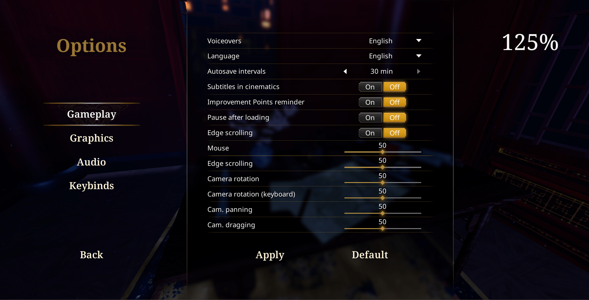
UI SCALING
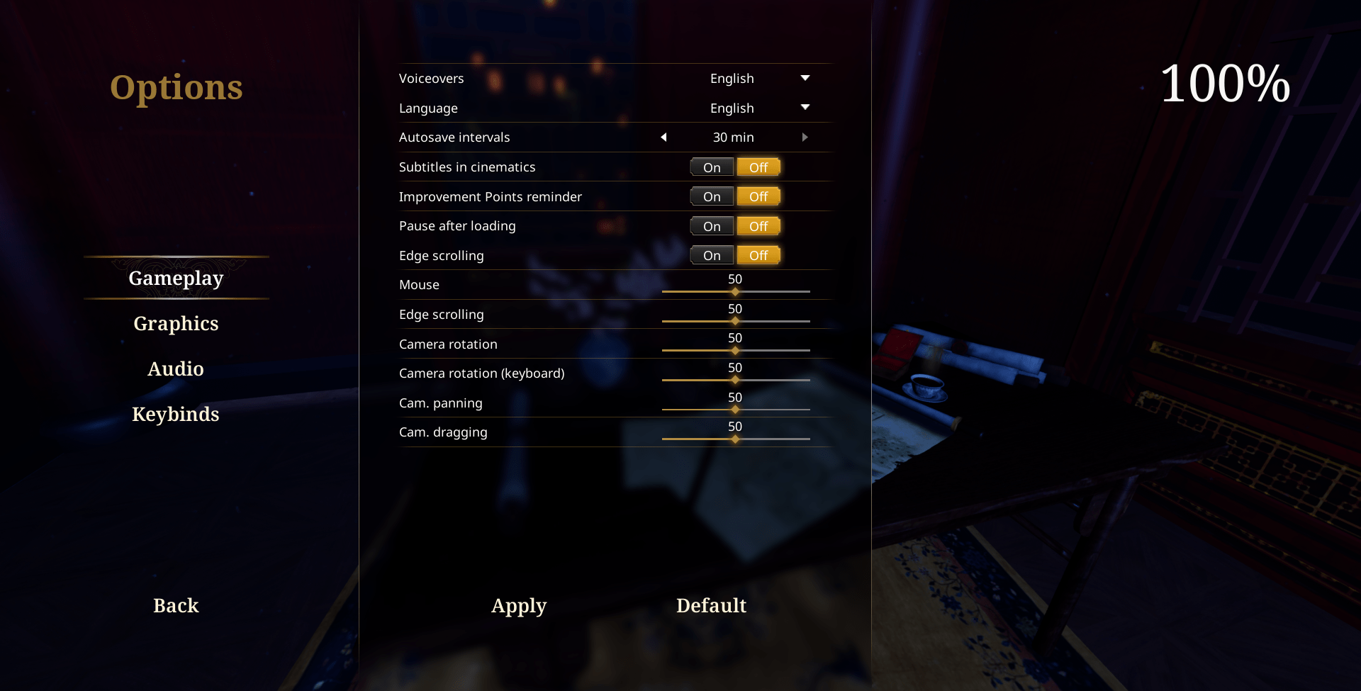
If you think that’s the end, you couldn’t be more wrong. We saw your constant rambling about the uncustomizable size of UI elements. For some of you they were too small, thus quests were hard to read and, but for the other half of you, it took up too much space on your screen. We chose to follow your suggestions and meet you halfway by including UI scaling as an option in the settings. Although this feature is not ready yet, we are working on it, and it will be available in the full game’s release, so… just have some faith in us that it'll work without any problems.
If you think that’s the end, you couldn’t be more wrong. We saw your constant rambling about the uncustomizable size of UI elements. For some of you they were too small, thus quests were hard to read and, but for the other half of you, it took up too much space on your screen. We chose to follow your suggestions and meet you halfway by including UI scaling as an option in the settings. Although this feature is not ready yet, we are working on it, and it will be available in the full game’s release, so… just have some faith in us that it'll work without any problems.
Do you think that these changes will improve your city-building experience? No one likes crappy UI and having to go through a mess to find anything… so if you’ve got any other suggestions, share them with us! And if you want to show us some interesting examples of some hideous UIs, why not join our community discord server and let’s have a convo!
See ya!
The Devs
The Devs